Fine, fine, then. Let's do this. I don't know what the hell is Kwanzaa and if the design/colors are representative of something so I won't comment on that. I can say, however, that the text is misinformative. Are you also celebrating youth leadership in the rexdale community along with the Kwanzaa thing? Or is it a seminar of some sort? It's weird and not clear.
The second one is just bad all around. If you're being paid to make a design you have to bring more to the table than an amateur handout. We're in 2009, and with all the tools you have in a computer, it's unacceptable to hand in one that looks like it was made in Word.
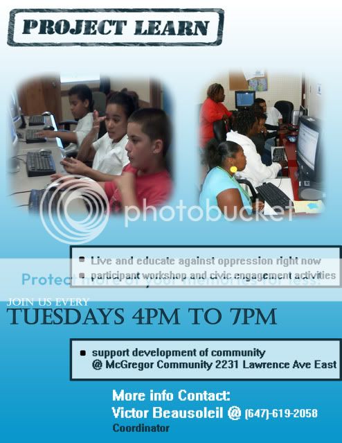
The "Project Learn" font is kind of tacky and positioned oddly. The two images are supposed to draw attention to the poster but seem to just divert from it. If you're going to blend them together, then blend them together, the point of the feathering is lost when you have a huge space between them. Also, they are not centered correctly or big enough to draw attention.
The font from the bullets is outdated and boring, the words in them don't quite make sense, and the grammar is all wrong. If you're going to start 1 bullet with a capital letter, start all of them the same.
"Join us every Tuesdays 4PM to 7PM" should read "Join us every Tuesday from 4PM to 7PM". Drop the s from tuesday, the "from" is optional, but I think it's better.
The background is too simple for a professional level if you're not being simplistic overall.
Also, the contact info doesn't quite invite people to call, the wording could be a lot better. And are you sure you aren't missing the place where these things are going to take place? Because even if you're going to paste this at the door of said place, you'd want the flyer to contain that info.
What I am trying to say is that if it's a job, and you're being paid (or not) and if it's going to your portfolio as a designer, you could do much better. I'm not even good with photoshop and I could come up with something better. These lack the professional look.